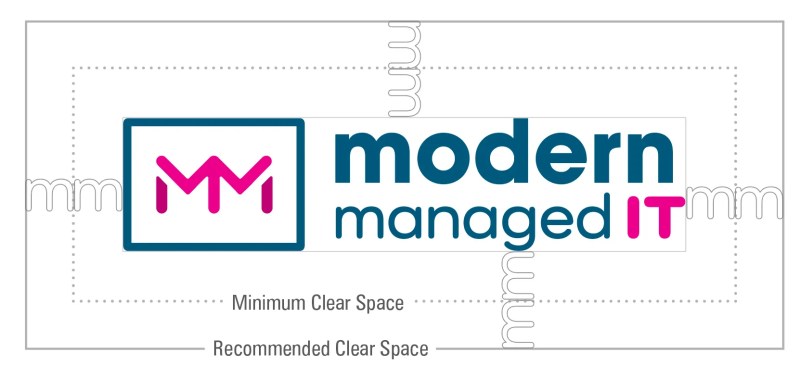
If you have a logo (and most of you reading this probably do), you want to make sure you’re giving it the space it needs. Wait, my logo needs space? Yes, but not in a smothering relationship kind of way. I’m referring to the term clear space as it relates to logos, and more specifically, the proximity of a logo to other visual elements. A logo needs an appropriate amount of space around it in order to visually stand out and function as intended. How do you know you have the appropriate clear space around your logo?
An Important Part of a Brand Style Guide
Hopefully, you were given a brand style guide (we create style guides for our branding clients) that accompanied your finished logo. Within that style guide, it’s common to include clear space rules for your logo. There should be clear space guidelines for all versions of your logo in various orientations (commonly you will have versions that are both horizontal and stacked).
If you don’t have a brand style guide, the following example illustrates a typical approach for determining both the minimum and the recommended amount of clear space for your logo.
Minimum and Recommended Clear Space
We always like to include both minimum and recommended guidelines for clear space around your logo. There can be so many applications of a logo that sometimes the “ideal” amount of clear space is not possible or conducive within a layout. The minimum clear space allowance is definitely pushing the limits. Placing your logo closer to another element than the minimum clear space will start to look crowded and uncomfortable.
How to Use It
Typically, a character or graphic portion of your logo is used for reference in measurement. In the first example we have above, we’ve used the lowercase “m” as the base measurement. Using a visual component of the logo as the measurement for the amount of clear space make this tool scalable at any size and not dependent on any particular computer software. In this example, one “m” length is the minimum amount of clear space between another element and the logo. The recommended space is two “m” lengths.
Does It Really Matter?
Your logo is the visual embodiment for your brand, and with that lofty role you really want to make sure it’s presented in it’s best light. Not only is it important to make sure your logo is scalable and responsive, it’s important not to crowd your logo too close to other objects or elements. Crowding your logo can really make your brand look and be interpreted as unbalanced, unprofessional and just plain harder to differentiate from the crowd. Remember, your logo is always communicating on behalf of your brand. Every time a customer or potential customer sees it, there is some brand recognition and perception that is being built communication is actually being made about your brand. This simple principle of clear space should always be top of mind when placing a logo, whether you have a formal style guide or not.


