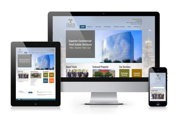
 Travis Commercial Real Estate Services, a leading commercial real estate company in San Antonio, wanted to refresh their overall brand and website.
The goal of the rebrand was to slowly transition, rather than radically reinvent the logo, mindful of the investment required to apply the brand across signage throughout the city.
Logo and Stationery
 While maintaining the original mark and overall type arrangement, Robot updated the typography of the logo and replaced a drab khaki with a brighter, fresher shade of green. A bold pattern was added to a new stationery package, and a secondary color palette was developed.
Website Updates
The updated logo and color palette are pulled into the design of the new website, along with refreshed content and new photography. Technical upgrades to the website included:
- Integration with third-party property search tools, allowing for automated refreshing of current property listings
- Responsive design, allowing users to access the site using mobile devices and tablets
- An easy-to-use content management system, making it possible for Travis Commercial to update copy and photos throughout the site


