Archive for the ‘Project Highlights’ Category

How Social Ad Campaigns Helped Reach Target Audiences During the Pandemic

Posted by

As businesses adjusted their services and offerings to address the 2020 pandemic, social media was a go-to medium. We helped several businesses and organizations get the word out to their target audiences. Here are just a few examples.

“On-Pointe” Social Media Ads Increased Ballet Class Registrations
The Ballet Conservatory of South Texas understands how their service meets their target audience’s needs. This made it easy for us to craft messaging on Facebook to inform that classes were still happening (both virtually and social distanced in-studio) and promote them as the top choice of schools to attend. The social media ads we created for the Conservatory specifically emphasized their differentiator (training that can lead to a professional ballet career). The result was a full roster and branded content to fill their newsfeed.

Registration social campaign ad for ballet company Registration social campaign ad for ballet company

Local Restaurant Meal Subscription Ad Campaign with Messaging their Target Audience Ate Up
Pharm Table knows they need to reach a very specific audience. Their food is not just tasty and beautiful, but also made to act like medicine for the body and mind. With increased need for meal deliveries (especially during the pandemic), they wanted to promote their convenient meal subscriptions to target audiences that would see the benefit in their food: those interested in vegan food and in a natural detox or an Ayurvedic diet in the San Antonio area.

Meal subscription social campaign ad  Meal subscription social campaign ad

LinkedIn Advertising and Content Marketing for Oil and Gas Accounting Firms
With the COVID-19 pandemic still at large, brands are still needing to deliver related information to share to their target audiences. We recently created social media advertising campaigns for Eddye Dreyer Financial Services and The Resource Group LLC to get relevant and timely information to the right audience at the right time.

Covid-19 content campaign social ads Covid-19 content campaign social ads

Need help with digital marketing? Contact us for a free consultation.

In a Digital World, Does Direct Mail Still Work?

Posted by

Gaining customers starts with awareness. Even though the Metropolitan Methodist Hospital is one of the more well-known hospital systems in San Antonio, their Emergency Room facility at the Quarry Market Shopping Center was relatively new, and residents didn’t always remember where they were located. So, the hospital reached out to Robot Creative for help with an awareness campaign.

The challenge was to get word out to the families living around the Quarry Market about the full-service ER right in their neighborhood. To do this, we presented a plan that included digital marketing blended with traditional forms of advertising like community outreach and direct mail.

According to a research by the Data and Marketing Association conducted in 2018, direct to consumer advertising has a response rate ranging between 5% for prospect lists (possible customers) and 9% for house lists (current customers). Physically handling a post card can create a different response than seeing an ad on a screen. According to stats quoted by the USPS, a majority of consumers feel mail is more personal than the internet and prefer it as the format for unsolicited information on unfamiliar companies.

Knowing that the tactile effect of a physical mailer was likely to have a good response rate, we developed several campaigns featuring hyper-local content that would appeal to our target audience.

  1. Post Cards – We designed and sent post card series to family households in the targeted region around the ER. These included information on the location of the facility as well as a brief description about services and unique qualities of that facility. There were two series, one with designs that featured local students/parents and one with prominent residents from the area. This gave readers familiar faces with which to identify and engage. We also included static and variable maps, showing each household’s unique directions from their location to the ER. This personalized and local experience made these mailers more relevant for residents in the area. Imagery from each campaign was utilized in both social and print advertising during the same time frame, increasing frequency and reach on the selected audience.
  1. Magazines – We also created a special magazine, In the Loop, to specifically reach new residents who recently moved into the same neighborhoods. These magazines gave a more in-depth overview of the Metropolitan Methodist Hospital and Quarry ER, still including information like location, but also education on preventative care and when to visit the ER versus an urgent care center or a full-service hospital.MMEC In The Loop Magazine

Compared to their peers within the system, the patient count at the Quarry ER increased 18% in the first year of this effort, while the system average declined. This proved that awareness campaigns utilizing a multi-touch point approach can and do work for B2C marketing.

Need more customers coming into your location? Contact us today to develop a winning strategy.

Akimbo — Zeroing in on Cost of Acquisition

Posted by

Akimbo Card is a prepaid debit card service developed for family budgeting. When Akimbo came to us, they were looking for strategy and creative that would not only improve app downloads and card activations but also maximize ad spend to the right audiences in order to lower cost of acquisition of new registrants. To solve this problem, we developed app, search, display and social ads targeting three unique audiences and tested for click-through rate, cost per click and cost per acquisition. With weekly campaign management, messaging revisions and audience adjustments, we were able to increase enrollments by more than 150% while lowering cost of acquisition by nearly 50%.

 “The Robot Creative team has been fantastic to work with. They iterate quickly to maximize your marketing budget, and have lowered our customer acquisition cost by nearly 50%,” said Houston Frost, Akimbo Senior VP of Corporate Development and Prepaid Products.


New Customers Make Us Smile: A Direct Mail Project Highlight

Posted by

Hale_eblastHow do you attract new customers into a dentist’s office without feeling like you’re pulling teeth? In order to help Dr. Brian Hale’s dental practice gain new clients, Robot Creative designed a successful direct mail campaign that helped generate new business.

The first round of postcards is exceeding monthly goals. After just one month and with only a portion of the postcards sent, Dr. Hale has already gained 20 new customers, who will each get cleanings twice a year. Direct traffic to Dr. Hale’s website has also seen a 119% increase over the same time frame from last year, and the number of incoming calls has increased greatly.

  • The message, “Around the Corner” – In this campaign, people who live within a 1.5 mile radius receive postcards with a simple message: with the nearby office of Dr. Brian Hale, great dental care is “just right around the corner.” A prominent map helps recipients find the office and see just how close it is.
  • Custom photography of Dr. Hale and his actual employees (versus the stock photography used by most dentists) illustrates how friendly and neighborly this practice is. The custom photographs are also great assets that can be used on Dr. Hale’s website and other promotional materials in the future.
  • A clear call to action encourages recipients to call and schedule consultation.

Regarding the success of the campaign so far, Dr. Hale said, “The campaign has gone as well as expected or better; I think using the actual pictures of us instead of stock has been very powerful.”

Looking for ways to increase your visibility to your target audience?

From direct mail to digital advertising, Robot can help you find the right mix to meet your goals. Learn more about our advertising and visibility services  and contact us to schedule a consultation.

Social Media Project Highlight: Mama Margie’s Mexican Cafe

Posted by

To help popular fast-casual Mexican food restaurant, Mama Margie’s, grow and engage their social following, Robot Creative developed and implemented a social strategy that encourages sharing, two-way conversations and fan-created content.

  • Mama’s Favorites Campaign — With this ongoing campaign, photos posted by fans on Instagram are selected and shared on the Mama Margie’s official Facebook page. By cross-promoting the official Instagram account and Facebook page, the campaign has dramatically increased engagement in both channels while also providing a wealth of fan-generated content.
  • Facebook-specific flash deals reward shares and comments with extreme offers available only for a very limited-time. On April Fools’ Day, a Facebook post claiming that the restaurant was considering dropping a popular menu item (bean and cheese tacos) exploded with 371 comments and 60 shares. A follow up post explained the joke and offered bean and cheese tacos at $0.50 each, nearly half off the regular price, for that day only. The follow up post also received 57 comments and 166 shares.
  • Regular monitoring and response engages followers in conversations. Tweets from official Mama Margie’s Twitter account strive for a “sassy mama” voice, increasing the “share-ability” of the communication with a little humor.
  • In-store promotion drives social media campaigns further, with table tents that encourage users to share photos and experiences on social media.
  • Paid Facebook advertising also plays a role in the overall approach, helping to grow followers and promote posts to people not already connected to Mama Margie’s.

As a result of these tactics over the first six months of implementation, Mama Margie’s Twitter following grew 99% and Instagram following grew 332%. In addition, Facebook content reached over 1.5 million people, Mama Margie’s was mentioned directly in over 250 tweets and Instagram hashtag engagement increased by 41%.

LegalPRO Software Branding, Collateral and Website Development

Posted by

IGN_websiteBRP_websiteLegalPRO develops, sells and supports legal software products. To support the growth of LegalPRO’s most popular product, BankruptcyPRO, and to assist cross-promotion efforts for other products, Robot developed a cohesive suite of brands, brochures, tradeshow materials and integrated websites for the parent company and its products.

Websites for BankruptcyPRO and I-Got-Notices, two software products, were part of an all-encompasing brand overhaul for LegalPRO in which the spirit, energy, and accessibility of a small team were captured through an updated website and accompanying collateral materials.

LegalPRO’s “big enough, but not too big” size and flexibility were the key messages communicated through team highlights, approachable language and selective use of hand-drawn graphics to emphasize the approachable nature of the LegalPRO team.

Robot also created a company overview brochure that carries across the same style of imagery and the message of individualized service. The LegalPRO team is a big focus in the brochure and is introduced with a fun, personable approach, representative of the company brand. Illustrated headshot photos with brief personal bios provide a snapshot of each individual’s personality.

LegalPRO’s company culture and attentive customer service set them apart from the industry. The new branding and sales tools highlight these key differentiators and provide end users with a company overview that is in-line with its approachable attitude and personalized service.  

Cultivating Interest and Sales for Hunting in a Farmer's World

Posted by

HIAFW_bookBusiness advisor and author John F. Dini released Hunting in a Farmer’s World in 2013 to the acclaim of critics and business owners nationwide. With its unique insight into the minds of entrepreneurs, the ground-breaking business book has received numerous awards and top reviews from some of the nation’s greatest business authors and experts.

Robot Creative contributed to the brand development and launch of the book, producing the book’s cover design, graphic illustrations used throughout the interior pages, a responsive website design with a lead capture strategy and a social media approach that includes community development and paid social advertising.

The website promotes the book and, through social media integration, builds a community of “hunters”. The site’s features include:

  • A lead capture strategy
  • An interactive quiz for users to gauge where they fall on the farmer/hunter spectrum (and share their results via social media)
  • Story sharing for the hunter community – users can share their own stories and read about the experiences of their peers
  • Incredible testimonials from respected business leaders like Seth Godin, Marty Zwelling and Gino Wickman
  • Excerpts from the book

Hunting in a Farmer’s World has proven to resonate deeply with entrepreneurs. Robot’s marketing and promotional efforts aim to capture that enthusiasm, transform readers into loyal members of the “hunting community” and encourage them to share the book with others.


Cultivating Interest and Sales for Hunting in a Farmer’s World

Posted by

HIAFW_bookBusiness advisor and author John F. Dini released Hunting in a Farmer’s World in 2013 to the acclaim of critics and business owners nationwide. With its unique insight into the minds of entrepreneurs, the ground-breaking business book has received numerous awards and top reviews from some of the nation’s greatest business authors and experts.

Robot Creative contributed to the brand development and launch of the book, producing the book’s cover design, graphic illustrations used throughout the interior pages, a responsive website design with a lead capture strategy and a social media approach that includes community development and paid social advertising.

The website promotes the book and, through social media integration, builds a community of “hunters”. The site’s features include:

  • A lead capture strategy
  • An interactive quiz for users to gauge where they fall on the farmer/hunter spectrum (and share their results via social media)
  • Story sharing for the hunter community – users can share their own stories and read about the experiences of their peers
  • Incredible testimonials from respected business leaders like Seth Godin, Marty Zwelling and Gino Wickman
  • Excerpts from the book

Hunting in a Farmer’s World has proven to resonate deeply with entrepreneurs. Robot’s marketing and promotional efforts aim to capture that enthusiasm, transform readers into loyal members of the “hunting community” and encourage them to share the book with others.


Travis Commercial Real Estate Brand and Website Update

Posted by

TC_LOGOTravis Commercial Real Estate Services, a leading commercial real estate company in San Antonio, wanted to refresh their overall brand and website.

The goal of the rebrand was to slowly transition, rather than radically reinvent the logo, mindful of the investment required to apply the brand across signage throughout the city.

Logo and Stationery
travis_stationeryWhile maintaining the original mark and overall type arrangement, Robot updated the typography of the logo and replaced a drab khaki with a brighter, fresher shade of green. A bold pattern was added to a new stationery package, and a secondary color palette was developed.

Website Updates
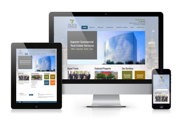
The updated logo and color palette are pulled into the design of the new website, along with refreshed content and new photography. Technical upgrades to the website included:

  • Integration with third-party property search tools, allowing for automated refreshing of current property listings
  • Responsive design, allowing users to access the site using mobile devices and tablets
  • An easy-to-use content management system, making it possible for Travis Commercial to update copy and photos throughout the site

travis-responsive


A Brand-Driven Approach – Sierra Motors

Posted by

Front1b

Sierra Motors first contacted Robot to develop a logo and identity package. But after the logo, stationery and messaging were complete, we didn’t stop; in fact, you might say we punched the accelerator.

Environmental Branding
It was important to Sierra Motors that customers immediately pick up on the brand message when they walk onto the lot or into the sales office. To communicate this message, we developed custom vehicle magnets with main messaging points, testimonial posters highlighting customer feedback, license plates with custom frames and rearview mirror hangers. We also provided signage recommendations for each lot.

Refreshed Website
Screen Shot 2012-06-29 at 4.23.23 PM
To tie the brand into Sierra Motors’ online presence, we designed and produced content for sierra-motors.com. Functions of the website include a simple lead capture form, a refer-a-friend feature and access to an online payment portal for customers.

Collateral Materials
To round out Sierra Motors’ identity, Robot Creative developed additional printed pieces, including a tri-fold with vehicle maintenance guidelines and a handout card with information on Sierra Motors’ referral program.

Read more about the original brand development

A Menu Refresh is Just What Mama Ordered

Posted by

In conjunction with a full interior redesign, Mama Margie’s reached out to Robot Creative to design their new digital menu boards. The new menu design creates a cohesive brand for this restaurant chain by integrating custom food photography, an expanded color palette and new branding elements with the refreshed interior design.

The customers’ ordering experience and Mama Margie’s sales goals were distinct areas of focus for this redesign. Starting with menu design psychology and consumer behavior research, Robot Creative made recommendations on the structural layout of menu including categorization, item placement and panel arrangements to maximize profitability.

For a restaurant that is open 24/7, it was important to make the most of the digital format. Flexible, rotating spaces were incorporated to run limited time offers, to highlight featured items and to target certain menu items during specific times of day. The new menu prominently features brand-essential menu items through strategic placement and photography.

Branding Goes Through The Roof

Posted by

Roof Monitor™, a revolutionary product for the roofing industry, reached out to Robot Creative to create a cohesive, memorable brand and marketing approach for their product launch.

Brand Strategy
As a new technology, one of the main goals of the product launch was education. It was critical for Roof Monitor’s target market to quickly understand the product and its benefits. A straightforward and memorable name combined with a descriptive tagline immediately convey the message behind the product and its purpose. Robot reinforced the distinctive color and shape of the Roof Monitor sensors in every aspect of the design for the brand, from the logo to the illustrations to the infographics used in collateral materials.

Website and Social Media
Robot developed a responsive website to tell the Roof Monitor story that seamlessly transitions from a desktop computer to a tablet or other mobile device. Additionally, Robot established a foundation for Roof Monitor’s online social media platforms, including strategy, graphics and initial post design for Facebook, Twitter and LinkedIn.

Product Launch
The product launch coincided with a major industry trade show. Robot Creative provided event strategy, designed graphics for a 20’x20′ island exhibit and developed related collateral materials.  Specialty invitations enticed industry leaders to an exclusive preview dinner, and social media countdowns created buzz leading up to the event. A feature article was timed for release in one of the industry’s most prominent trade publications in the weeks following the launch event.

Music Festival Promotion Design: Die Nacht Der Clubs

Posted by

Robot recently designed the promotional materials for Die Nacht Der Clubs (Night of the Clubs), a music festival in Hamburg, Germany, for which participants buy bus tickets that take them to up to 25 local music clubs. We designed the logo, posters, flyers, stickers, admission tickets, web banners and landing page.

This festival is unique in that there isn’t just one genre of music or club included in the lineup. Clubs and music styles at the 25 venues include punk, techno, house, metal and even jazz. It’s a full sampling of the great variety of bands that these clubs showcase, and Die Nacht Der Clubs is a single event that brings them all together. The client was looking for an overall clean look that didn’t lean towards any one of the music styles.

So if you happen to be in Hamburg on May 9th, buy a ticket, hop on a bus and enjoy some great music and a variety of local clubs. Tell them Robot sent you!

Case Study: A Pool of New Customers

Posted by

Love to Swim and Tumble School provides swim lessons, tumble lessons and parties with one established location in San Antonio and a newer location in Schertz. The goal of this initiative was to drive new enrollment at their Schertz location.

Challenge: Develop a Selling Idea 
For this deal to be the most effective, buyers needed to get hooked with the deal and then be converted into year-round enrolled students. One lesson might have done the trick, but Love to Swim and Tumble School felt confident that after a full month of lessons, buyers would love the program and remain enrolled. The offer was crafted for one month of swim lessons at half price, with a waived registration fee. To prevent a crash in revenue due to regular customers cashing in on the offer, the deal was limited to new customers and was only valid at the Schertz location. We didn’t want the regulars to feel excluded, so the deal included an offer to benefit them as well. They were able to purchase the deal as a gift and receive referral bucks.

Keep The New Customers Coming Back
Once the Groupons were purchased, it was time for the real work to begin. These deal customers weren’t just any customers – they were new prospective year-round customers that needed to be tracked as sales leads. With over 1,200 students in and out the door each week, tracking them would be no easy feat. The school set up their software to alert staff when a Groupon customer checked in for their last lesson and to prompt them to ask about the customer’s experience and whether or not they wanted to remain enrolled in swim lessons. In less than 2 steps and 1 minute, the customer’s enrollment was continued.

Results
Love to Swim and Tumble School sold a total of 295 Groupons, and has had approximately 141 redemptions so far. “Groupon was a great way to reach a large audience and to get new people through the door. Now it’s our job to impress these people and get them to remain enrolled after the one-month deal is over”, said Carra Millikien, General Manager of the Schertz Location. It looks like they’re off to a great start! Of the new customers obtained through Groupon, 94 have already completed their free month and 60 of these have decided to remain enrolled.

Laying the Path for More Web Traffic

Posted by

Background
Terramano is a family owned business that manufactures and sells authentic handmade terracotta and saltillo tile. To increase sales through the internet, Terramano wanted to focus on improving organic search results and Google AdWords campaigns.

Key Challenges

  • Content – Terramano’s site was built with a template site editor and looked nice, but it only contained basic information on the company and was not written to what the customer wants or needs. There were no clear product descriptions, few keywords, and the navigation did not clearly indicate the information to be found on each page.
  • Tracking – The site editor allowed for only minimal tracking that showed the number of visits per day. We were unable to see statistics regarding entrance and exit pages, geographic location, sources of traffic, and the time visitors spent on site. If we were going to evaluate the quality of traffic, we would need to put detailed tracking in place to measure the performance of the site.
  • Keyword Differentiation – Terramano was unsure which keywords people used most when searching for their products out of the many variations, i.e. mexican tile, terracotta, saltillo, clay tile, etc.

Strategy

  • Keyword Development – Extensive keyword research determined which search terms Terramano should focus on. For example, “terracotta tile” and “mexican tile” are searched far more often than “saltillo tile”.
  • Content Development and Website Restructure – We restructured the site and navigation to be more user-friendly and intuitive, developing content for the Home and Products pages that better explains the different types of tile and available colors, sizes and finishes. Also included in site changes were new photographs with descriptive file names and image tags containing keywords and information about geographic areas served, since Terramano’s products are sold throughout the US and Mexico.
  • Tracking Installation – Moving the site out of the content management system allowed for more sophisticated tracking. We took this opportunity to clean up the code and install Google Analytics, which provides detailed information on site visits, including traffic from Google AdWords.
  • Link Strategy – We developed a link strategy for Terramano that included recommendations for industry trade groups and organizations they may want to join.
  • AdWords Campaign Restructure – Keyword lists in Terramano’s account were expanded based on research and the campaigns were reorganized. One set of ads now targets users looking for tile floors in general, and another set targets users searching specifically for terracotta or clay tile. Conversion tracking also measures which keywords and ads result in contact form submissions.

Results
Since February, Terramano has climbed in organic rankings for all of their keywords, and is on the first page for many. They are now getting visits from serious prospective clients and receive several form submissions every week. Organic search traffic for August compared to March increased by 70.1%, and has been steadily climbing month by month.

For pay per click search engine traffic, the number of site visits has increased by 150% due to more effective ad wording, which improved the average click through rate from 0.55% to 10%. The quality of these leads has improved as well, demonstrated by a 12% decrease in the average bounce rate. Terramano continues to climb in rankings and looks forward to selling their unique products to a more targeted audience.    

Search Engine Rankings*

6a00d8341cceeb53ef0133f3877524970b

* Search engine rankings change often. These results are from August 25, 2010 and show rankings for searches within the San Antonio area.

Securing a Web Presence

Posted by

Background
ThreadStrong is a self-paced, e-Learning solution, designed by Denim Group experts, to help developers understand and apply the principles of secure application development. ROBOT built the ThreadStrong website as a multi-purpose site: 1) as a sales tool/online brochure to which Denim Group could direct leads to more information about the product, and 2) as a front-door for prospects looking for application security training. ROBOT built the site to be search engine-friendly from the start, so we employed much of the SEO strategy during the site development.

Challenges

  • Search Terms – Both “e-Learning” and “application security” go by many different names (i.e. virtual training, computer-based training, software security, etc).
  • Competition – ThreadStrong has several direct and indirect competitors on a national and international level.

Strategy

  • Keyword Development – Keyword research determined which phrases and keyword variations were used most often in searches. Because broader terms, such as “application security training”, were the most popular, and very few people actually search for “e-Learning”, we decided to focus our efforts on addressing the broader need of application security training.
  • Content Development – Keyword research also helped shape the site structure during development. Messaging focuses on why e-Learning was an important component of an overall training program. Goal keywords were also incorporated into the site content, including page headers and image tags.
  • Link Strategy – ROBOT developed and implemented a link strategy, which included an industry-targeted social media approach specific to ThreadStrong. Denim Group principals are heavily involved in the application security industry and are active social media participants. Denim Group experts reached out to other industry experts through blogs and other social media to get links back to the ThreadStrong website.
  • Google AdWords Setup – ROBOT set up a campaign within Denim Group’s AdWords account to drive immediate traffic while waiting for search engines to organically index the site (which can usually take up to 90 days).

Results
Threadstrong is being found for over 200 search phrases including “application security training”, “secure coding in .net” and “secure software training courses”. Search engine traffic in the past 3 months increased by 55% from the same 3 months last year, with visitors from 22 countries around the world.


Facebook Icon Twitter Icon LinkedIn Icon Instagram Icon